the brand
Optimisthink is Web Design and Development start up agency that adopts a user centered approach in its design and development processes. By focusing on the users point of view user satisfaction is enhance by improving usability, accessibility and pleasure provided during visiting it's website.
Challenge
To create a brand identity system for Optimisthink that will surely stand out yet keeping it's design clean and simple.
SOLUTION
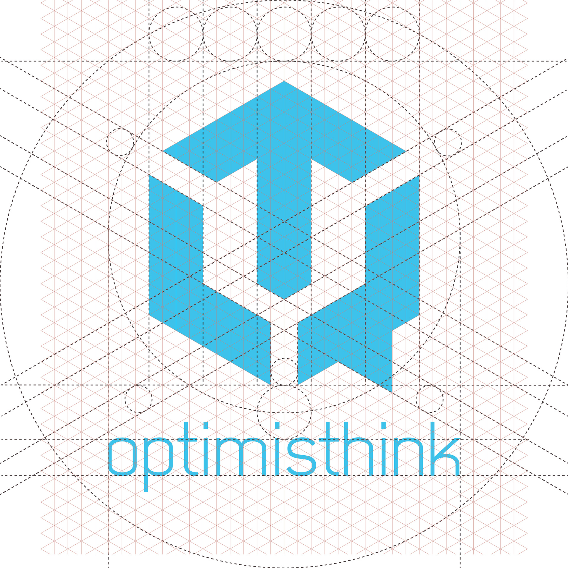
I created a logo that looks techie at a glance. The logo is basically a hexagon in blue color which is the standard design for tech related logos. What made this logo stand is how I utilized shapes to create interesting symbols.


Logotype
The logo is made up two symbols, a speech bubble and an upward pointing arrow. The speech bubble symbolizes open conversations, brainstorming, collaboration, research while the upward pointing arrow signifies growth, positivity and upward trends.
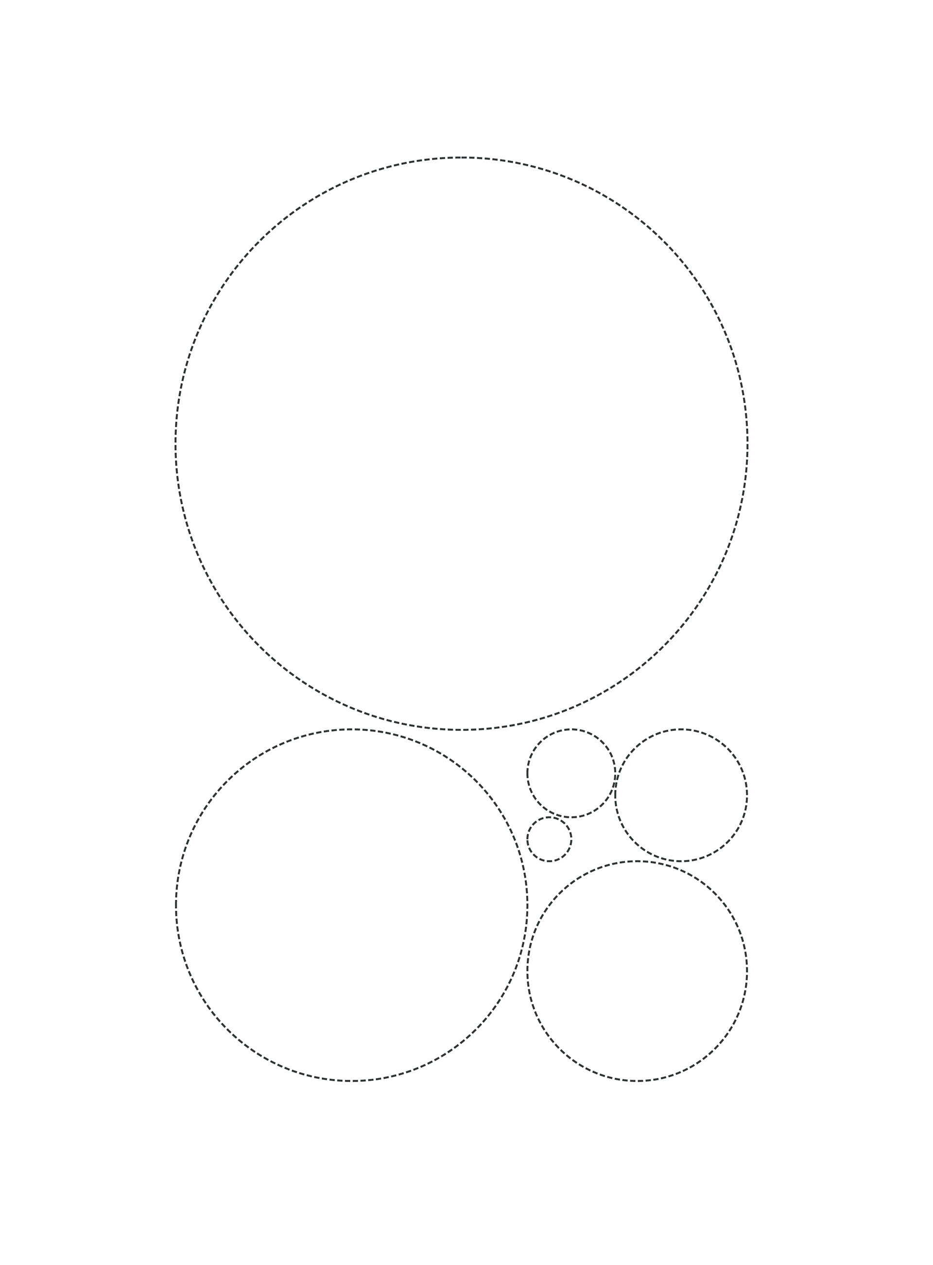
To achieve over all harmony of the logo I used Fibonacci's Golden circles to maintain consistent ratio between negative space and the symbols.
Contact me
Thank you!